![]()
Tips for poster design
Technical guidelines: Layout
Plan your layout carefully. Layout includes
- Headings and subheadings.
- Organising the information into sections.
- There should be balance and simplicity.
- Deciding where you want to add graphics, photographs, graphs, etc.
- Do not try to present too much detail. Less is more.
- Leaving enough white space - don't clutter the poster, it should have a clean and simple layout.
- Provide your name and contact details for people that might want to discuss it with you.
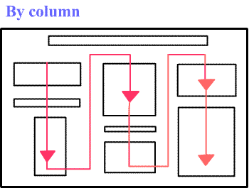
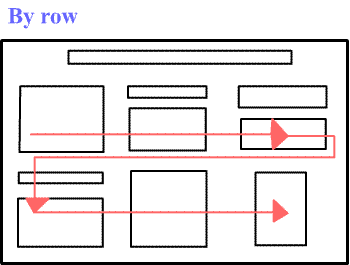
- Information should flow (viewing sequence) by column or by row, as in the following examples:
Hint: A numbering system in your poster will help your audience to follow the flow of the information easily.
Hint: Cut all your sections out in real size and place them on a table. This will help you to move and rearrange sections until you are happy with the final product.